Table of Contents
Technical analysis is critical if you aim to become a trader, especially understanding trading graphs, and knowing how to read a chart can add significant value to your trading skills. Are you also looking for the same? Read on.
To learn how to read trading charts, you need to have an eye to see the data plotting on the chart. By looking at it, you can analyze the direction the financial instrument is about to move.


What is a forex chart?
A forex chart represents a graphical representation of how the price of a currency pair changes over time. The price values are plotted on the vertical y-axis, while the horizontal x-axis shows time.


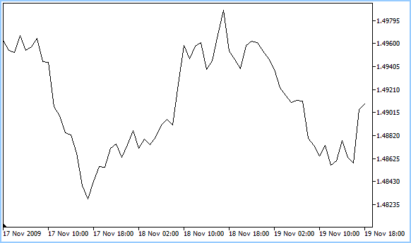
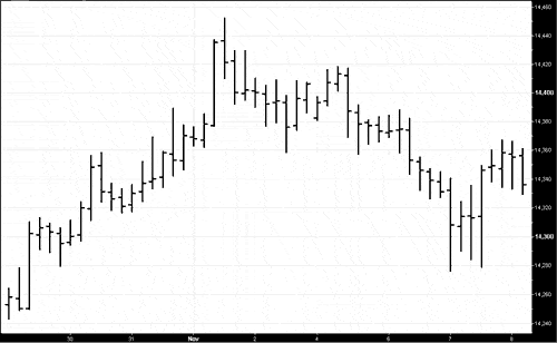
Below is a presented forex chart example:
How to Read Forex Charts?
To read forex charts, traders must learn to identify low and high prices, trading patterns, and trends during various time frames. However, there are three types of trading charts: line charts, bar charts, and candlestick charts. Usually, candlestick charts represent the complete type of charts that contain the most information, such as open, closed, high, and low price levels for each candlestick.

How to catch a trend in forex?
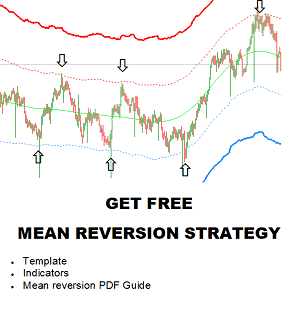
To find a trend on any trading chart, traders use technical indicators and trend lines to confirm the overall direction of a currency’s price. In the first step, traders determine a breakout move on a forex chart where a new high or low is made, and resistance or support is broken. Then, traders draw a trendline on a price chart as a diagonal support or resistance level. Finally, traders can confirm trends using moving average indicators or seek logical confirmation of a movement based on macroeconomic parameters.
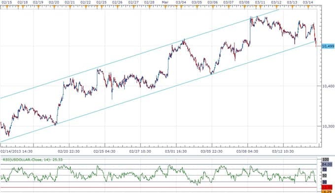
Example of the bullish trend on forex trading chart
Finding trends, whether they’re going up, down, or around, and even understanding when they’re about to reverse is the secret to your Forex trading. You must know how to follow charts no matter what commodity you’re trading. Analyzing trading charts is crucial in this field; you will eventually become a good trader with time and practice.
This article aims to start you on your path to knowing and using charts to improve your trade.
Using a trading chart, you can be called a technical trader. Technical traders adopt chart tools and metrics’ forecasting abilities to define peak patterns and price ranges to enter and leave market marks.
Also, traders tend to monitor news outlets that provide updates on economic activity, oil production, job data, interest rate shifts, and geopolitical drivers such as conflict and political uncertainty.
We will start by knowing the trading map before focusing on trends and indicators. In short, the graph displays the market prices between the two financial products shown in a chart.
When you learn of the bullish cycle, you’re looking at the general upward trend (presume a bull trying to charge), whereas the Bearish trend is a declining trend of downs (presume a bear hidden in the forest). A third form of movement is sideways, horizontal, or flat.
An extensive demand happens when the commodity price approaches the same highs (resistance level) and lows (support level) three times. It’s said that they’re trading in a spread.
What are the Different Types of Trading Charts?
- Line Charts:
- Display price data as a single, continuous line.
- Show closing prices for each period (e.g., day, week).
- Valid for a clear, simplified view of price movement.
- Bar Charts:
- Represent price movements using a series of vertical bars.
- Each bar shows the opening, closing, high, and low prices for a given period.
- More informative than line charts, revealing price range and direction within the period.
- Candlestick Charts:
- Similar to bar charts, use ‘candles’ with wider bodies.
- The body shows open and closed prices; the wicks show the high and low.
- Color-coded for straightforward interpretation (commonly green for rising, red for falling prices).
- Famous for identifying patterns and market sentiment.
- Heikin-Ashi Charts:
- A variation of candlestick charts designed to filter out market noise.
- Use average price movements for smoother chart patterns.
- It helps identify trends and potential reversals.
- Point and Figure Charts:
- Focus solely on price movements, ignoring time and volume.
- Use a series of Xs and Os to represent upward and downward price movements.
- It helps identify clear support and resistance levels.
- Renko Charts:
- Also, ignore time and focus on price change.
- Use colored bricks to represent price movements of a fixed size.
- It is ideal for spotting trends and minimizing the impact of minor price changes.
- Mountain Charts:
- Similar to line charts but filled below the line.
- The ‘mountain’ part is often color-filled, which makes it visually impactful.
- It helps show the general rise and fall of security prices.
- Area Charts:
- It is similar to mountain charts but typically less dramatic.
- The area between the line and the baseline is shaded.
- Useful for emphasizing the magnitude of price movements.
Each chart type provides a different perspective on the market and is chosen based on the trader’s strategy and the specific analysis required.
Three main types of charts come forward when we talk about technical charts. They are unique and give specific information about the market; it is on traders to comprehend it and make sense to earn profits.
Line Chart
A line chart represents a simple chart type that displays trends over time. This graph usually reflects just the closing price for the period. The closing price is also considered the most significant factor in the data analysis. The line chart links the closing rates over a defined timeline. There is no graphic data or trade spectrum, meaning no peaks and falls and nothing about opening rates.
Line chart
Bar Chart
A bar chart is a graphical representation of OHLC (open, high, low, close) price values consisting of an opening foot—facing left—a vertical line, and a closing foot—facing right.
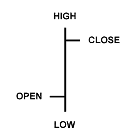
Extending the line chart in greater depth, the bar chart contains many more crucial snippets of details applied to every other data set on the graph and is made up of a vertical line series where each line depicts trading knowledge. They reflect the trading day’s high and low levels and the open and close rates. A short horizontal line defines the free and the near price.
Bar chart
The open value is a ‘dash,’ which is positioned on the left of the vertical bar, and the near price shown by a parallel horizontal line is on the right of the bar. Comprehending the trading chart is straightforward; if the left dash (open price) is lower than the right dash (closing rate), the bar will be colored orange, black, or blue, indicating a price rise and a valued instrument. The reverse is valid, and the diminished value of the stock is seen in red.
Candlestick Chart
What is a candlestick in forex trading?
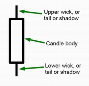
Candlesticks represent a type of price chart that displays a security’s high, low, open, and closing prices for a specific trading period. The Candlesticks Body represents the price range, open-to-close. The Wick or the shadow shows the highs and lows.
After you have learned the line and bar charts, it is time to switch to the candlestick chart. It is pretty similar to the bar chart. The vertical lines of the two charts show the trading period’s price points, while the candle’s structure uses various colors to reflect the market fluctuations of the span.
Going back to the 17th century, the Japanese started to use a scientific method for the trade-in rice known as technical analysis. It is fascinating that Japanese candlesticks are widely used even today. The data reflected from the candlestick involves low, high, close, and open values.
The body can be seen as ‘hollow’ and ‘colored’ parts. Long, thin outlines above and below the ‘body’ reflect lower or higher ranges and are often pointed as shadows, wicks, or tails. If the lines are positioned at the top of the body, this will show you the high and closing rates, whereas the lines at the bottom of the chart show the low and the closing price of low.
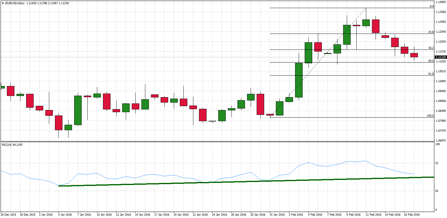
Example on candlesticks charts for EURUSD
The body colors vary from broker to broker but are usually green, indicating a price rise, or red, reflecting a price decline.
A hollow candlestick is where the near price is better than the market value, informing traders to buy. Filled or colored candlesticks with less value, the opening would show the selling spot. Long and short, bodies would offer the BUY or SELL tension between traders.
Short-term bodies reflect very little market change and are mostly viewed as a convergence phenomenon known as Doji. Doji is an essential aspect of the candlestick graph as it details various candlestick trends. These shape when instruments open and close to nearly identical rates, with slight price disparity.
Doji candles’ importance is to indicate to investors that after a long green candle, the purchasing pressure starts to wane, or after a solid red candle, the panic selling will start to reduce. It leads to a balance between supply and demand.
Candlestick charts are widely used in trading due to their numerous benefits. Here are some key advantages:
- Clear Visual Representation of Price Movements: Candlestick charts provide an easy-to-interpret graphical representation of price movements. Each candlestick shows the open, high, low, and close prices for a specific period, making it straightforward to see the market’s movements at a glance.
- Identification of Market Trends and Reversals: Candlestick patterns can help traders identify bullish and bearish market trends and potential reversals. Patterns like ‘doji,’ ‘hammer,’ ‘engulfing,’ and ‘shooting star’ are commonly used to predict future market movements.
- Shows Market Sentiment: The color and size of the candlestick bodies and wicks can indicate the strength of market sentiment. For example, a long green (or white) candlestick typically indicates intense buying pressure, while a long red (or black) candlestick suggests intense selling pressure.
- Valid for Multiple Time Frames: Candlestick charts can be used for various time frames, from very short (like minutes) to long-term (like months), making them versatile for different trading strategies, whether day trading, swing trading, or long-term investing.
- Combined with Other Technical Analysis Tools: Candlestick charts can be effectively combined with other technical analysis tools and indicators, like moving averages, volume, and momentum oscillators, to make more informed trading decisions.
- Helps in Risk Management: By understanding candlestick patterns, traders can set better stop-loss and take-profit orders based on support and resistance levels identified in the chart, aiding in effective risk management.
- Rich in Information Yet Simple to Learn: While providing a wealth of information, candlestick charting is relatively easy to learn compared to other charting methods. This makes it accessible to both novice and experienced traders.
- Effective Across Various Markets: Candlestick charts are not limited to a specific market and can be used in stock, forex, commodities, and cryptocurrency markets.
- Timing Entry and Exit Points: The precise nature of candlestick formations can help traders time their entry and exit points more accurately, potentially increasing profitability.
- Historical Analysis for Pattern Recognition: Traders can study historical candlestick patterns to anticipate future market behavior. This pattern recognition is a critical component in many trading strategies.
Learn the Graphical Analysis of Charts
There are a lot of trends that you can recognize only by glancing at the graph. Chart patterns are premised on the idea that human behavior does not alter quickly, so history replicates itself.
Chart patterns illustrate the psychology of capital markets, assuming that they have succeeded in the past, so will they work next time. They send you hints about the path the pattern will likely go. They are at the center of all critical market fluctuations that form a correlation across trends. It would help if you used chart trends as a stand-alone strategy for your investing.
A few crucial patterns are the Triangles, a continuity pattern indicating a war between soaring and declining values. This means that the price will likely proceed in the direction it is headed until the trend is detected.
Another prominent trend to recognize is the double top, showing the value reaching two highs and suggesting the price reversing to the bearish way from the bullish pattern. Its opposite – the double bottom – describes a trend turnaround from bearish to bullish, implying an inevitable uptrend. From such instances, you can realize how essential it is to recognize trends for your trading performance.
Learn to Use Indicators
When you get more acclimatized with reading and analyzing graphs, you can add additional instruments, like technical measures, to calculate price movement and change in value.
These statistical metrics can help you learn whether stocks are oversold or over-purchased. If a stock is oversold or over-purchased, it fails to sustain its course, sometimes indicating a turnaround is inevitable. You can use momentum sensors, such as oscillators, to calculate the asset price’s speed or velocity. Instances of the most widely used dynamic metrics are MACD, Stochastic, or RSI. (Read our article about MACD 2 line indicator for MT4)
Other ways of analysis can allow you to determine when to take a trading position or leave a trade, including the Bollinger Bands. Trend line metrics such as the Moving Average help determine how the market moves by cutting off all the noise from small price fluctuations.
You may use several of these measures to validate the signal. They all appear on most of the trading sites.
FAQs on How to Read Trading Charts
What is the Data on the Trading Chart?
Traders use several metrics to read the market graph, but at its heart, it holds two essential bits of information – value and quantity. Anything other than past prices and volume details is nothing other than speculation. Yet, these halves of knowledge are crucial to anticipate possible price movements. Volume shifts are often ignored, but growing volumes indicate a much more substantial change, likely to persist, whereas declining volumes display a lack of confidence among traders.
What Do I Need to Search for in a Trading Chart?
The trend line is the first thing most technical traders measure while considering a market graph. Markets are not necessarily trending all the time, and you may not have a strong trend pattern. You need to focus on a more extended period to see the pattern. The support and resistance ratios are similar to the trend line, which could be the upcoming thing you’re looking for on your graph. Here, it might sound right to broaden the possibilities for finding long-term support or resistance levels that can be incredibly significant.
What’s the Most Crucial Technical Indicator While Reading a Chart?
It’s hard to find the most significant indicator on any graph. The trend line and the level of support or resistance are critically important, and traders who depend on these factors would find trading very critical. Regarding technical metrics, the moving average in various time frames may be the most relevant predictor since many traders implement them as a base of their trades, particularly the 50-day and 200-day moving averages.

He is an expert in financial niche, long-term trading, and weekly technical levels.
The primary field of Igor's research is the application of machine learning in algorithmic trading.
Education: Computer Engineering and Ph.D. in machine learning.
Igor regularly publishes trading-related videos on the Fxigor Youtube channel.
To contact Igor write on:
igor@forex.in.rs