Chart patterns are a compact way of getting information related to price movement. They can be found within price charts. They assist traders in technical analysis. These are generally color-coded and help traders in many ways. If you are new at it, it might take some getting used to, but it will be worth it.
As these charts take the past price movements to suggest future price movements, they enable traders to develop viable strategies. If traders know what they are hoping to see, these charts can be of tremendous help.
List of chart patterns
Popular forex chart patterns are patterns that traders usually use in their strategies; traders promote in their books such as top 10 chart patterns:


- Head and Shoulders
- Double Top
- Double Bottom
- Rounding Bottom
- Cup and Handle
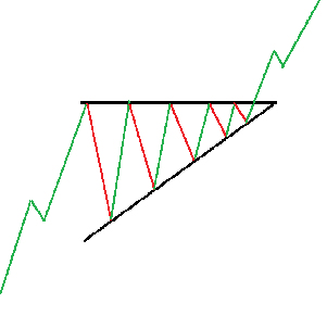
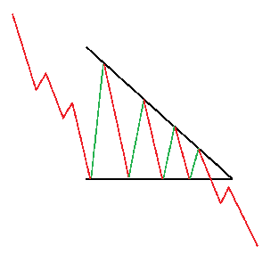
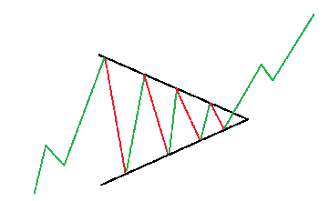
- Wedges
- Pennant or Flags
- Ascending Triangle
- Descending Triangle
- Symmetrical Triangle
Let see how to read forex chart patterns:


1. Head and Shoulders
The Head and shoulders chart pattern represents the three peaks pattern that two outside peaks are close in height, and the middle peak is highest. Head and shoulders chart formation occurs when a market trend is in the process of reversal.
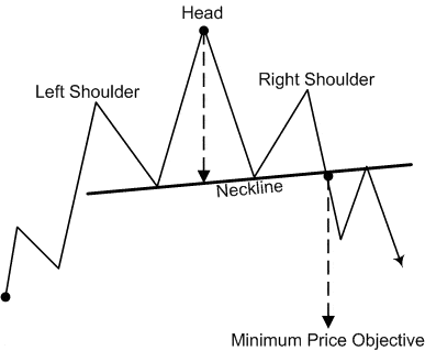

This chart pattern has three peaks, a longer one in the middle and two comparatively smaller ones on the extremes. The traders use this chart pattern to anticipate a bullish to a bearish reversal in the market.
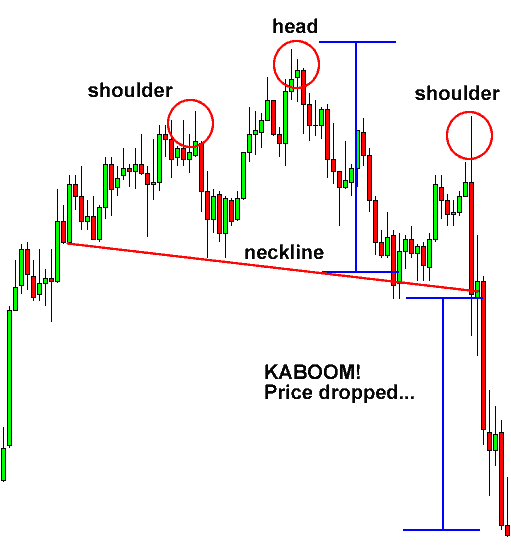
Generally, the middle peak or the second is the larger one. Eventually, these peaks will fall to the previous level of support, also called the ‘neckline.’ As soon as the third peak also falls back to the neckline, the chances of the market reversing into a bearish downtrend are highly likely.
2. Double Top
The double top chart pattern represents a bearish chart pattern after two consecutive times the high price (two tops) with a moderate decline between the two highs.
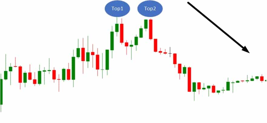
As the previous chart pattern, this one is also used to identify possible market reversals. An asset’s price will peak when demand overpowers supply, but it will retrace back eventually to the support when buyers start closing their positions. This price will climb up one more time and will reverse to support on a more permanent basis. It will go against the prevailing trend, but it will retrace back to support.
3. Double Bottom
The double bottom chart pattern represents a bullish chart pattern after two consecutive times the low price (two bottoms) with a moderate upside potential between the two lows.
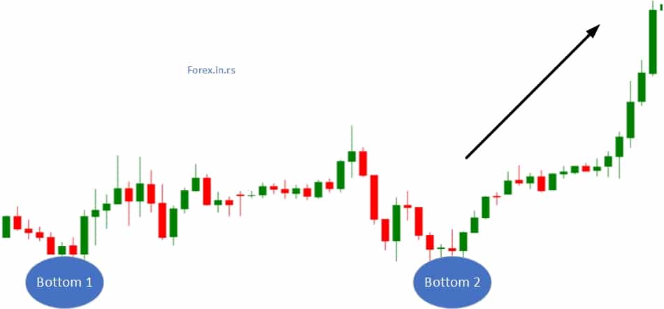
The double bottom pattern shows that there is more supply than demand in the market, which leads to the fall in the prices of assets. This period of selling can make the prices drop below the support level. These prices will rise and move towards the level of resistance but will drop again. Eventually, there will be a trend reversal, and an upward motion will begin. The market will become bullish.
As the double top is considered a bearish reversal pattern, this one is regarded as a bullish reversal pattern. It signifies that the downtrend has ended, and the market will see an uptrend now.
4. Rounding Bottom
The rounding bottom represents a U-shaped trough chart pattern, which ultimately shifts into a slow, gradual increase.
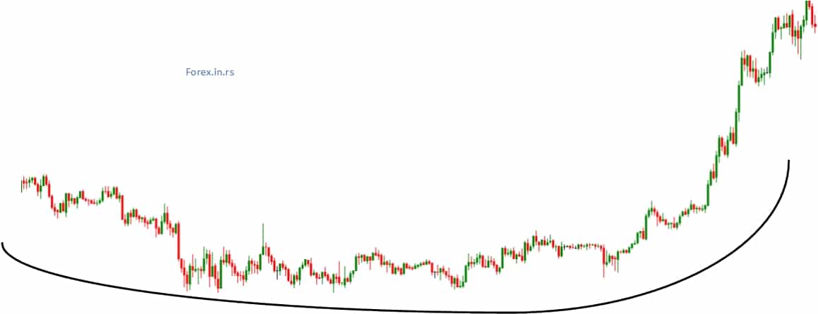
This chart pattern can be used to check both reversal and continuation of a trend. It isn’t uncommon to see the prices of an asset falling slightly back even during an uptrend. These prices will rise again, asserting that traders are trading in a market with bullish continuation.
You can use rounding bottom to check reversals as well. Suppose there is a downtrend, and you see a rounding bottom forming before the reversal of a trend. This will be a reversal as now; the prices will enter the bullish uptrend.
Traders can use this chart pattern by keeping an eye on its formation and buying halfway above the low point. They can make profits on the trend continuation once the prices break above resistance.
5. Cup and Handle
A cup and handle forex pattern is a bullish continuation pattern that resembles a cup with a handle, where the cup pattern is in the shape of a “U.” The handle pattern has a slight downward drift.” U” shape looks like a cup and handle looks like a triangle.
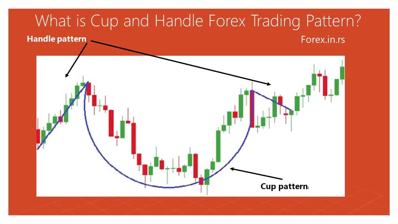
Cup and handle a bullish continuation pattern. The traders use it to look for any period or hint of bearish sentiment before the trend ultimately follows the bullish motion. When looked closely, the cup will remind you of the rounding bottom chart formation. The handle can be compared with the wedge pattern.
An asset’s prices are likely to see a temporary retracement after a rounding bottom. This phenomenon is termed as the handle. This retracement occurs between two parallel lines, which look like a handle on the price graph. Eventually, the asset will leave the handle and follow the bullish trend again.
6. Wedge chart pattern
The wedge chart pattern represents a price pattern marked by converging trend lines on a price chart, such as an upward range trend in prices (rising wedge) or a downward trend in prices (falling wedge).
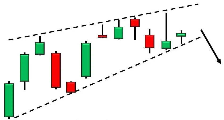
The price movements of an asset tighten up between two sloping trend lines, wedges are formed. Wedges can be both falling and rising. Both types of wedges are reversal patterns.
When you see a trend line between support and resistance, represented by two upwardly slanted lines, it is called a rising wedge. You will see that the support line is steeper as compared to the line of resistance. A rising wedge is a premonition of a more permanent decline in the price of an asset. This wedge is indicative of a bearish market.
When you see a trend line between two lines sloping downwards, it is called a falling wedge. You will see that the resistance line is steeper as compared to the line of support. A falling wedge indicates that the prices will break through the resistance and rise eventually. The falling wedge represents a more bullish market.
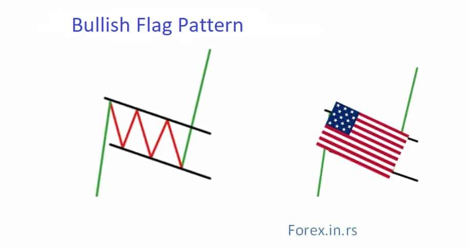
7. Pennant or Flags
Flag trading patterns recently we described in our article.
The bullish flag chart pattern represents the bullish breakout pattern during the main bullish trend, after a short period of consolidation, formed in an area less than 50% of bullish retracement.
The bear flag chart pattern represents the bearish breakout pattern during the main bearish trend, after a short period of consolidation, formed in an area less than 50% of bearish retracement. Price oscillation during the period of consolidation can be usually presented as a flag.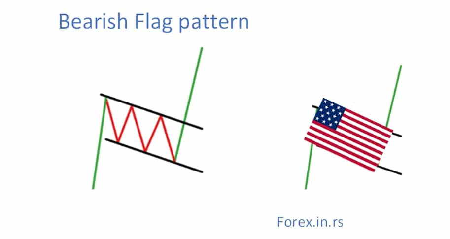
When there is a consolidation in an asset’s prices after witnessing an upward movement, flags or pennant is created. Traders are likely to witness a significant increase in the prices when the trend is still anew. After that, you will see a series of many smaller downward and upward movements.
Pennants chart patterns represent a continuation chart pattern, formed after a large upward or downward movement, followed by consolidation, before continuing to move in the same direction.
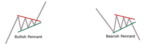
Pennants are versatile as they can identify both bullish and bearish signals and reversal or continuation of a trend.
This pattern appears to form a triangle, which looks similar to the wedge chart pattern. The difference is that it is not as narrow as a wedge. The other difference is that pennants or flags are always horizontal, while wedges are either ascending or descending.
8. Ascending Triangle
The ascending triangle represents a chart pattern where the horizontal line can be drawn along the swing highs, and a rising trendline can be drawn along the swing lows.
This chart pattern shows the continuation of a bullish trend that signifies that an uptrend is in continuation.
These triangles often have at least two identical peak highs. This allows the formation of a horizontal line. The trend line in this pattern stands for an uptrend, and the horizontal line indicates the past level of resistance.
9. Descending Triangle
The descending triangle represents a chart pattern where the horizontal line can be drawn along the swing lows, and a downside trendline can be drawn along the swing highs.
The descending triangle is the bearish equivalent of an ascending triangle. It signifies the continuation of a downtrend. As the market is falling, traders prefer to open short positions with CFDs to capitalize on the existing market scenario.
Descending triangles show that the market is in control of the sellers. Therefore, the pattern usually shifts lower and can break through the level of support. You are likely to see the formation of successive lower peaks, signaling that the trend is likely to continue.
Descending triangles are formed by a horizontal support line and a resistance line that slopes downwards. The trend line will eventually break through the horizontal support line, and there will be a continuation of the downtrend.
10. Symmetrical Triangle
A symmetrical triangle represents a chart pattern where two converging trend lines connecting a series of sequential peaks and troughs. A new trend will be created when price breaks one of the trendlines. Usually, price breaks in the direction of the main trend.
Unlike the other two triangle chart patterns, this one does not represent any particular market. It can be either bearish or bullish. It generally signals the continuation of a trend. The market will likely continue in the same direction, and the trends are unlikely to see a reversal.
While this chart pattern signals the continuation of a trend, if the market has been indecisive before a triangle pattern is formed, the market could go in either direction. This is why symmetrical triangles are seen as bilateral patterns; that is, they are useful when the market is volatile, with no clear indication regarding the movement of an asset’s price.
Chart patterns and price levels
To trade chart patterns, traders need to recognize chart patterns, define important price levels, and do time impact analysis before trade execution. Traders can create trades after several triggers are presented.
One shoe does not fit all. Similarly, there is no ideal or best chart pattern. Every chart pattern follows or highlights a trend, but how they do it and what precise value they give differs. These charts are viral in candlestick trading as it is easier to see past openings and closings of the market through them.
Every chart pattern has a USP, with some being more suitable when the market is volatile while others when there the market is indecisive. There are different patterns for both bullish and bearish markets as well.
While there might not be one universal ‘best’ chart pattern, there is one for you. Depending on the market in which you are trading, there is one ideal chart pattern for you. It is straightforward to go along with a wrong or a chart that is incompetent for your market. This article will help you in finding your perfect match. This will allow you to maximize your profits.
As these charts use support and resistance levels as their fundamentals, it is important to know what these levels are and how they facilitate trading.
- The level at which the price of an asset stops falling only to bounce back is called support.
- The level at which the price of an asset stops rising before going back down is called resistance.
Support and resistance levels represent a balance between demand and supply (or buyers and sellers). When demand overpowers supply, the prices will rise. This is because the sellers are in control. There are fewer sellers and more buyers, which means that availability is less, and the one that pays more will get. Similarly, when there is more supply than demand, prices will fall as there is a surplus of a commodity and not enough buyers in the market.
In both situations, there will come the point when prices stop rising or falling. For example, let’s assume that an asset’s price is rising as there are more buyers than suppliers. This will allow the prices to move up vertically. However, this rise will come to an end when, after a particular price, the buyers will be unwilling to pay more. They will rather close the position than to pay a hiked price.
This will create resistance. The price will decline and try to move towards the support level. This happens because supply will increase as more buyers close their positions. Once the prices have fallen to buyers’ preference, they will start buying again and open more positions. There will be the creation of a support level at this position as demand and supply try to reach an equilibrium.
If the buying continues, the price will rise again towards resistance because demand is more than supply again. The price will fall again when buyers close positions again. This back and forth remains in the trading market.
Different Types of Trading Chart Patterns
Three types of chart patterns can be categorized into the following classes:
- Continuation patterns tell that the current trend is likely to continue.
- Reversal patterns signal that an ongoing trend has the possibility of changing the direction.
- Bilateral patterns tell traders that the market has become volatile, and the prices can move in either direction.
Opening a position with CFDs will be the best choice with all of the above chart patterns. This is because CFDs are versatile. Traders can go short and long with CFDs as they allow them to speculate on both falling and rising markets. You can opt to go short when there is a bearish reversal or go long when there is a bullish reversal. You have the liberty to hold either position, depending on the chart pattern.
What the chart patterns show is not set in stone. These are called indicators, which means that they only indicate the direction in which the market moves. If you are using them for technical analysis, do keep in mind that chart patterns cannot guarantee anything. It would help if you used them with caution.
Do chart patterns work?
Chart patterns work based on trading community experience, scientific research papers, trading literature, and personal experience. Many companies created pattern recognition software to analyze chart patterns and made statistically significant proof that bullish and bearish chart patterns can be used in price prediction.
Chart patterns are great for technical analysis. The charts explained above can help you understand how and why the prices of assets behave or move in a particular way. As chart patterns can clearly define the level of support and resistance, it becomes easier for traders, even the new opens, to decide whether they would want to open a long or a short position. As you can see, if the trend is reversing, you can even close a position. Like with other aspects of training, understanding chart patterns can also take some time but incorporating them in your trading strategy will be rewarding.

He is an expert in financial niche, long-term trading, and weekly technical levels.
The primary field of Igor's research is the application of machine learning in algorithmic trading.
Education: Computer Engineering and Ph.D. in machine learning.
Igor regularly publishes trading-related videos on the Fxigor Youtube channel.
To contact Igor write on:
igor@forex.in.rs