Data heavily informs trading decisions, with charts as crucial visualization tools for traders. Comparing charts across different assets or time frames offers a multifaceted view of market dynamics, including trend confirmations, relative performance, and correlation insights. Such comparisons also aid in spotting market leaders, understanding sector performances, and validating significant market moves. However, while invaluable, chart comparisons should be integrated with other analytical tools and methodologies to ensure well-rounded trading strategies.
How to Compare Charts on TradingView?
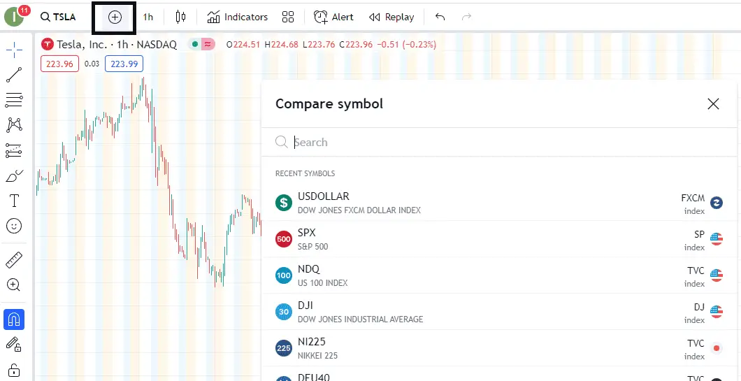
To compare charts on TradingView, choose the “+” symbol (Compare button) in the TradingView horizontal menu at the top of the chart window. You will get a list and the ability to add another asset on the same chart.


Here’s a step-by-step guide on how to compare charts on TradingView:
- Open TradingView: Navigate to the TradingView website and log in to your account. You can still access charts with limited features if you don’t have an account.
- Choose a Primary Asset: Enter the ticker symbol of the primary asset you wish to analyze in the search bar at the top. For instance, if looking at Apple Inc., you’d type “AAPL.” Click on the relevant result to open its chart.
- Add a Comparison: Once the primary chart is open, look for the “Compare” button or the “+” symbol at the top of the chart window. Clicking on it will open a dropdown menu or a search bar.
- Search and Add Secondary Asset: In the search bar, after you click “Compare,” type the name or ticker of the second asset you want to compare. For example, if you want to compare Apple Inc. with Microsoft, you’d type “MSFT.” Click on the relevant result to add it to the chart.
- Adjust Settings: By default, the secondary asset might be added as an overlay on the primary chart. If you wish to adjust how the secondary chart is displayed:
- You can change the style (lines, candles, bars, etc.).
- Opt for a separate panel below the primary chart.
- Modify the opacity to see both charts.
- Adjust the scale (logarithmic or linear) if needed.
- Customize Visuals: TradingView allows you to customize colors, line thickness, and other visual aspects of both charts to differentiate them better or to suit your preferences.
- Analyze and Interpret: With both charts visible, you can now analyze how the two assets perform relative to each other, identify correlations, or spot divergences.
- Remove or Replace Comparison: If you wish to remove or replace the secondary asset with another one, hover over its name at the top of the chart and click the “x” to remove or repeat the process from step 3 to add a different asset.
- Save Your Analysis: If you have a TradingView account, you can save your chart comparison setup for future reference by clicking on the floppy disk or the “Save” icon near the screen’s top-right corner.
By following these steps, you can efficiently compare different charts on TradingView and conduct a deeper analysis of market dynamics and asset relationships. Remember to cross-reference your findings with other sources and tools for a holistic understanding of the markets.

Please see my Video:
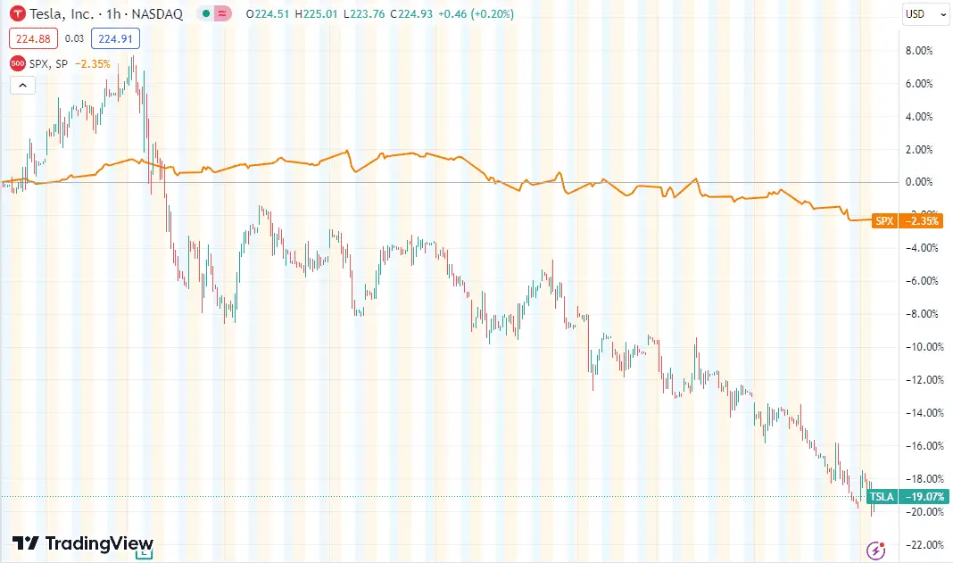
As you can see from my video, we can compare particular stocks with S&P500 or EURUSD with the US dollar. In that case, we can see what impacts price more, news related to the asset, or the whole market around the asset.
Let us compare EURUSD and USD :
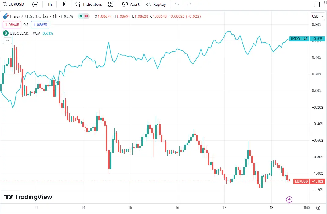
When the EURUSD rises, it indicates either a stronger Euro, a weaker USD, or a combination of both. If the USD is falling concurrently against other major currencies, then the increase in EURUSD is mainly due to the USD’s weakness. However, if the USD holds its ground or strengthens against other pairs while the EURUSD ascends, the Euro’s strength is the predominant force behind the movement.
Advantages of Comparing Charts
Comparing charts (either different assets or the same asset over different time frames) can offer a host of benefits:
- Trend Confirmation: One chart might show a particular trend, and comparing it to another might confirm or refute the strength or validity of that trend. For instance, if an asset’s daily and weekly charts show an upward trend, it may be a more decisive confirmation than if only a one-time frame showed the trend.
- Relative Performance: Comparing the performance of one asset to another can help traders decide where to allocate their resources. For example, suppose two stocks are in the same industry, and one outperforms the other. It may indicate a more substantial company or favorable market sentiment toward that stock in that case.
- Correlation and Divergence: Some assets have historically moved together (positive correlation) or in opposite directions (negative correlation). By comparing charts, traders can identify these relationships. For instance, if gold and the U.S. dollar index usually move inversely and this relationship changes, it might indicate a change in market dynamics.
- Identify Market Leaders and Laggards: In a bullish phase, some stocks or sectors advance and lead the market, while others lag. By comparing charts, traders can identify which ones are leading and which ones are lagging. This can be useful for portfolio allocation or hedging strategies.
- Historical Comparisons: By comparing a current chart to historical patterns, traders might find repeating patterns or behaviors. This can be useful in predicting future movements based on past behaviors, although it’s essential to remember that history doesn’t always repeat itself precisely.
- Intermarket Analysis: This involves comparing asset classes (e.g., stocks, bonds, commodities) to draw insights about potential market movements. For instance, if bond yields are rising (and bond prices are falling), it could indicate a potential shift of capital from stocks to bonds, which might be bearish for stocks.
- Sector Analysis: Comparing charts of different sectors can provide insights into which sectors are in favor and which are not. If technology stocks are outperforming utility stocks, for instance, it might indicate a risk-on-market sentiment.
- Validation of Breakouts/Breakdowns: If a particular asset breaks a significant level (support or resistance), comparing it to a related asset or sector can provide validation. The move might be more credible if multiple related assets break out simultaneously.
- Risk Management: By comparing volatility and other risk metrics across assets or timeframes, traders can make more informed decisions about position sizing and stop placement.
Please read our latest article to learn how to calculate pips on Tradingview.
Conclusion
TradingView offers an intuitive and efficient method for comparing multiple assets through its charting platform. Users can seamlessly overlay additional assets onto the same chart by selecting the “+” symbol or the Compare button from the main menu. This functionality enhances analytical capabilities, allowing traders and investors to visually assess and compare the performance of different instruments in real time.

He is an expert in financial niche, long-term trading, and weekly technical levels.
The primary field of Igor's research is the application of machine learning in algorithmic trading.
Education: Computer Engineering and Ph.D. in machine learning.
Igor regularly publishes trading-related videos on the Fxigor Youtube channel.
To contact Igor write on:
igor@forex.in.rs
Related posts:
- Can I Trade on TradingView App?
- Can You Trade on TradingView?
- How to Calculate Pips on TradingView?
- TradingView Review – Key Findings in 2024.
- The Best Elliott Wave Indicator on TradingView
- The Best Buy Sell Signal Indicator in TradingView!
- How to Add Moving Average to RSI in TradingView? – Steps and Video
- How to Use Volume Profile Indicator on TradingView for Free?
- How to Backtest on TradingView? – Free Strategy Scripts Without Coding
- Are Renko Charts Profitable?
- Renko Charts Disadvantages
- Does Metatrader 4 Have Footprint Charts?