Table of Contents
Trading is not simply about highs and lows, and to be honest; it is tough to identify which format to opt for with so many charts involved. If you’re not so time reliant when you trade, the line break chart would be the perfect option for you. These charts work regardless of the time and begin changing only when there is a significant change.
What is a 3 line break chart?
The 3 line break chart represents a chart where prices evolve based on price instead of time. This chart is presented using two colors black and white lines or blue and red lines. All changes on the chart are based on closing prices.


Download 3 line break chart for MT4 indicator


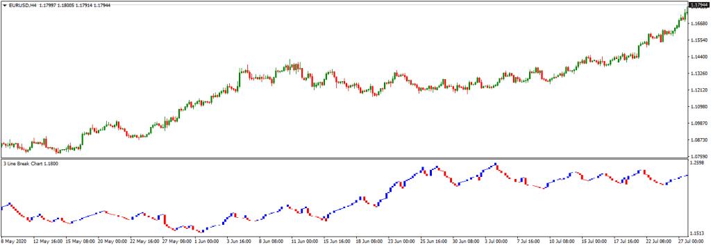
A total of 3 charts function together, displaying blue and red lines; the blue ones show the rise, and the red one implicates the downfall. All pricing details deviate towards a particular path until reversal is under warranty. Remember, a reversal is only visible when the closing price exceeds the high and low of the lines present before the functioning of recent ones.
To know more about what exactly it is about here’s, a line break chart explained right in this article!
How is a line break chart constructed?
Before you start understanding how a chart is formed precisely, you need to understand some aspects clearly. Primarily, the blue and red lines displayed on the charts are referable to as ‘lines.’ Furthermore, understanding the line changes is very important, as it only happens based on the closing prices, unlike other charts that focus on the high and low range. Such charts mainly evolve based on price, and time isn’t a crucial factor for them.

What are two-line reversals all about?
With every other closing price comes this set of three possibilities:
When the price is visibly extending in the same direction, a new line in a similar color is drawn to signify it.
Another line is drawn to signify a price change that provides a warranty to a reversal, but this time in another color.
There is no change or drawing of lines on the chart when the difference is not capable enough to warrant that particular reversal.
The highs and lows occurring on the lines indicate the chances of a reversal point. For instance, if the latest line is blue, i.e., pblueicting downfall, the highest amongst the last two lines will indicate a reversal point. To witness a complete reversal, closing above the justified high will display a blue line, signifying reversal. But, you should ensure that only the latest visible line should be blue, and the lines existing before that can be both in blue and red.
If the recent line is blue, then the low of the last two lines will determine the reversal point. The closing price before this low will require a display of a red line to finally justify a reversal in the price. But again, keep in mind that only the recent line in this situation be blue, not the prior ones.
What about three-line reversals?
The three-line break chart strategy works towards diminishing all three lines. Unlike two-line reversal that occurs during the trading range or continuing a trend of a more extensive scale ahead, it signifies more substantial moves, displaying a clear opportunity of a trend reversal. The bearish reversal of trend is visible when three blue lines are formed, and a redline interrupts, breaking the low. On the other hand, a bullish reversal is visual when three back lines are included, and a blue one tends to break the higher point formed with these.
What about support and resistance? Also, are there any specific patterns?
The basis of support and resistance is defined when there is an apparent reaction of both the highs and the lows occurring on the line break graph. Thus, it has a very similar function to candlesticks or bars charts when it comes to this factor. On the other hand, the patterns are double bottom, head-and-shoulders pattern, double top, triangles, and some other forms.
Conclusion
To sum up, let us not forget that the 3 line break chart isn’t the only Japanese invention when it comes to charts; Kagi and Renko charts are present. Just like them, these charts focus on displaying changes only when the prices are significantly fluctuating. Being in total dissimilarity with Point & Figure charts, there is no fixed size of the box, and instead, the amount relies on the last two lines, along with their respective ranges.
The added advantage of using the line break strategy is that you can discover the underlying trend with the utmost ease as it filters the other aspects out and focuses on price chanBut, Of course, being an analyst, you could also use other tools along with these charts for the best determination of higher highs and higher lows, along with lower highs and lower lows.

He is an expert in financial niche, long-term trading, and weekly technical levels.
The primary field of Igor's research is the application of machine learning in algorithmic trading.
Education: Computer Engineering and Ph.D. in machine learning.
Igor regularly publishes trading-related videos on the Fxigor Youtube channel.
To contact Igor write on:
igor@forex.in.rs
Related posts:
- Download Auto Break-Even Expert Advisor – Move Stop Loss to Break-Even MT4 & MT5 EA
- MT4 Forex Trend Line Indicator Download!
- Download SSL Channel Indicator For MT4!
- What is Break-Even in Forex? – Break-Even in Forex Trading!
- How to Show the Bid and Ask line on MT4?
- Download MACD Divergence Indicator MT4!
- Traders Dynamic Index Indicator – Download TDI Indicator
- FX Vortex Indicator Free Download
- How Do Renko Charts Work? – Download Free Renko Chart Indicator
- Moving Average High Low Indicator- Download Moving Average Channel Indicator MT4!
- Getting Started in Chart Patterns – Top Chart Patterns
- Download Pivot Point Indicator MT4