Table of Contents
Trend indicators are an essential part of trading–but they can also be one of the most frustrating aspects of trading if you don’t know how to use them or are using the wrong ones. Of course, trend indicators are not crystal balls; they won’t always give you clear or accurate answers, and relying on-trend upon indicators to make your decisions is certainly not recommended. But knowing how to use trend indicators and which can work for you is one of the best ways to make better trade decisions and increase your chances for financial success.
What Are The Best Forex Trend Indicators?
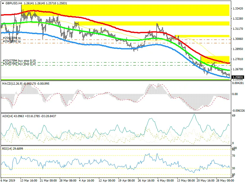
Relative strength index (RSI) and Moving Average Convergence Divergence (MACD) are the best forex trend indicators designed to gauge momentum and identify the current trends. They attempt to measure the trend’s strength and give traders a feeling for their strength.


In my trading experience, RSI detects momentum and it is excellent for divergence detection.


For several reasons, the Relative Strength Index (RSI) and Moving Average Convergence Divergence (MACD) are among the most popular technical indicators used in forex trading. Here’s why:
- Relative Strength Index (RSI):
- Overbought and Oversold Indications: RSI helps traders identify potential overbought and oversold conditions in the market. When RSI is above 70, it may indicate the market is overbought, and when it’s below 30, it may signal the market is oversold. These conditions can precede price reversals.
- Divergences: RSI can also highlight divergences between the indicator and price movements. For example, if the price is higher, but RSI is lower, it could indicate a bearish divergence, suggesting that the bullish momentum might wane.
- Easy to Use: RSI is a simple indicator to understand and use, making it accessible to traders of all experience levels.
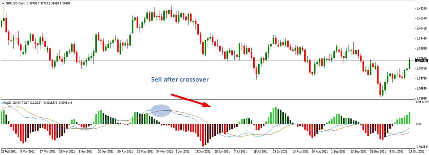
- Moving Average Convergence Divergence (MACD):
- Trend Identification: MACD helps traders identify the direction of the trend. When the MACD line crosses above the signal line, it may indicate a bullish trend, and when it move below, it may signal a bearish trend. This can benefit traders looking to align their trades with the current trend.
- Momentum Measurement: MACD also offers insights into the strength and momentum of the trend. When the distance between the MACD line and the signal line increases, it could suggest increasing momentum. Conversely, when the distance narrows, it could indicate decreasing momentum.
- Divergences: Like RSI, MACD can also highlight potential bullish or bearish divergences between the indicator and price action, potentially signaling upcoming reversals.
- Histogram: The MACD histogram provides a visual representation of the difference between the MACD line and the signal line, making it easier for traders to interpret changes in momentum.
However, while RSI and MACD can be practical tools in technical analysis, it’s important to note that no indicator is foolproof. They all have limitations and should be used with other indicators, price action analysis, and risk management strategies. Technical indicators are also more effective when used in markets with higher liquidity, like the forex market than in less liquid markets.
You can read our article to learn about the best momentum indicator.

Uptrends, downtrends, and ranges
The following trend indicator guides will refer to uptrends, downtrends, and ranges. It’s essential to have a quick refresher on what these terms mean to understand these trend indicators better.
Uptrend refers to higher highs and lows. A downtrend refers to lower highs and lows. And the range is contained between highs and lows.
You will also need to know what “Strong,” “healthy,” and “weak” trends mean in the context of trading trends. Strong trends have little to no pullback on their price; healthy trends have a healthy pullback that remains above the 50MA (moving average), and weak trends have a steep pullback that remains above the 200MA.
Forex Trend Indicators List
Here’s a long list of Forex trend indicators that traders commonly use to identify and analyze market trends:
- Moving Average (MA)
- Exponential Moving Average (EMA)
- Simple Moving Average (SMA)
- Weighted Moving Average (WMA)
- Moving Average Convergence Divergence (MACD)
- Parabolic SAR (Stop and Reverse)
- Average Directional Index (ADX)
- Ichimoku Kinko Hyo
- Bollinger Bands
- Donchian Channels
- Keltner Channels
- Envelopes
- SuperTrend
- Hull Moving Average (HMA)
- Triangular Moving Average (TMA)
- Chande Momentum Oscillator (CMO)
- Stochastic Oscillator
- Relative Strength Index (RSI)
- Commodity Channel Index (CCI)
- Williams %R
- Aroon Indicator
- Average True Range (ATR)
- On-Balance Volume (OBV)
- Volume Weighted Average Price (VWAP)
- Money Flow Index (MFI)
- Rate of Change (ROC)
- Moving Average Ribbon
- Pivot Points
- Fibonacci Retracement
- Elliott Wave Theory
- Andrews’ Pitchfork
- Gann Fan
- Renko Charts
- Heikin-Ashi
- Point and Figure Charts
- Range Bars
- Market Profile
- Tick Volume Indicator
- Time Segmented Volume (TSV)
- Elder-Ray Index
RSI Trend Lines as the Best Method to Determine Trend
RSI (Relative Strength Index) is famous technical indicator traders use to assess the strength and momentum of price movements in a financial instrument. While RSI is commonly known for identifying overbought and oversold conditions, it can also be used to determine trends through RSI trend lines.
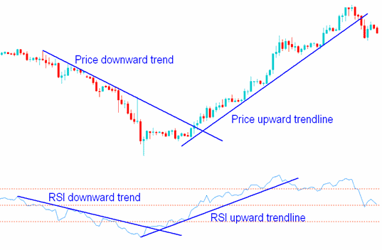
RSI trend lines are drawn on the indicator and can provide valuable insights into the underlying trend. Here’s how you can use RSI trend lines to determine trends:
- Understanding RSI Trend Lines: RSI trend lines are diagonal lines drawn on the indicator, connecting consecutive peaks or troughs. These lines help visualize the trend direction within the RSI indicator and can often provide earlier signals of trend reversals than price trend lines.
- Identifying Uptrends and Downtrends: You draw a trend line in an uptrend by connecting the consecutive higher lows on the RSI indicator. This trend line acts as support and indicates that the RSI is maintaining its bullish momentum. Similarly, you would draw a trend line in a downtrend by connecting the consecutive lower highs on the RSI indicator, acting as resistance and indicating bearish momentum.
- Confirming Price Trend: RSI trend lines can be used to confirm the price trend. If the RSI and price trend lines move in the same direction, it suggests a strong and healthy movement. For example, if the price is making higher highs while the RSI trend line is also sloping upwards, it confirms a bullish trend. Conversely, if the price is lowering lows while the RSI trend line slows downwards, it ensures a bearish trend.
- Spotting Trend Reversals: RSI trend lines can also help identify potential trend reversals. If the RSI trend line is broken, it may signal a change in trend direction. For example, in the RSI trend line is broken downwards in an uptrend, it could indicate a potential shift to a bearish trend. Similarly, if the RSI trend line is broken upwards in a downtrend, it could mean a potential change to a bullish trend. Traders often seek confirmation from other technical indicators or price patterns before taking action.
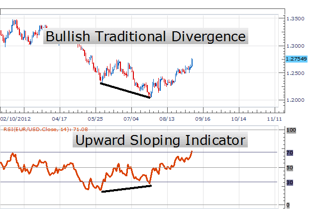
- Divergence: RSI trend lines can also be used to spot divergence, which occurs when the price and the RSI indicator move in opposite directions. A bullish divergence occurs when the price makes lower lows, but the RSI indicator forms higher lows, suggesting a potential trend reversal to the upside. Conversely, a bearish divergence occurs when the price makes higher highs, but the RSI indicator forms lower highs, suggesting a potential trend reversal to the downside.
In conclusion, forex trend indicators are crucial in helping traders identify and analyze market trends. By understanding the overall direction of price movement, traders can make more informed trading decisions and improve their chances of success.

He is an expert in financial niche, long-term trading, and weekly technical levels.
The primary field of Igor's research is the application of machine learning in algorithmic trading.
Education: Computer Engineering and Ph.D. in machine learning.
Igor regularly publishes trading-related videos on the Fxigor Youtube channel.
To contact Igor write on:
igor@forex.in.rs
Related posts:
- Types of Trend Indicators
- Download MACD 4C Indicator
- Forex Day Trading Best Indicators – Case Study
- List of Volatility Indicators
- Awesome Oscillator and MACD Strategy! – Awesome Oscillator vs. MACD
- Trend Dashboard Indicator MT4 Download – Forex Dashboard Free Download
- Download Half Trend Indicator MT4
- Download MACD 2 Line Indicator for MT4!
- Download MACD Divergence Indicator MT4!
- MT4 Forex Trend Line Indicator Download!
- Schaff Trend Cycle Trading System – Cycle Indicator MT4 Download
- ETF Trend Trading – Does It Work?